
The experts at our web design agency in London focus on delivering responsive websites that adjust to many types of devices and screen sizes.
Table of Contents
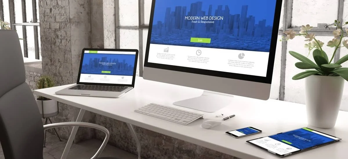
What is responsive web design?
Responsive web design is, as the name suggests, responsive to the device from which the webpage is accessed.
It is a key element when a client requests a mobile version for their website and it adapts to the type of device the individual who accesses the website may be using.
Is responsive web design relevant across multiple devices?
Yes. Responsive web design is essential in order to allow adequate use across multiple devices.
An advantage of using responsive web design is that it takes into account the features of the device on which the website is browsed.
This means that responsive web design in London takes into account multiple types of resolutions, such as those for an iPhone, an iPad, or an Android device.
What are the main features of a responsive website?
Responsive web design in London is defined according to a number of key features:
- Grids: the columns rearrange so as to fit the size of the screen (be it a desktop computer, a laptop, a tablet, or a mobile phone, with their respective sizes);
- Visuals: the media files will not be larger than the size of the screen on which they are used; this is a principle that is often called the “flexible container,” which resizes itself;
- Text: readability is taken into consideration, and breakpoints are added if the text has too many characters; in most cases, the column will include 70 to 80 characters; our team takes this into account for responsive web design in London;
- Others: included here are the meta viewport tag (which provides instructions to the browser on how to control the scaling and dimensions) and setting other attributes on the viewport (the viewport is the area of the window in which the content is displayed).
How do I know if my current website has responsive web design?
A key feature of responsiveness is whether or not the website adapts automatically to rearrange the text and images when switching devices. A static website (i.e., the opposite of a responsive one) will not adapt to a mobile device.
Simply put, your clients or customers will be hindered if they want to browse or shop on your website from their smartphones.
What are the main differences between responsive and non-responsive websites?
Some key differences between static and responsive websites refer to:
- Layout: the static website has a fixed layout while the responsive one has a fluid layout (it can adapt, as previously mentioned);
- Complexity: the static one is less complex, therefore it will also mean that the overall costs are lower;
- Content: the proportions of the content remain unchanged in the case of the static website, while they are adjusted to the device in the case of the responsive one.
A responsive website is not the same as a dynamic website, which is based on pages that display different content each time they are accessed.
Our team can perform a test to check the responsiveness level and, following an initial evaluation, propose solutions to increase this for mobile and web browsers.
Can you design my website to be responsive?
Yes, any website can be converted from non-responsive to responsive. Working with a web design agency in London, such as our experts, is advisable in this case.
Some of the key elements we focus on when designing new websites, in terms of responsiveness only, include:
- Mobile friendliness;
- Navigation friendliness;
- Performance optimization.
When converting your website from static to responsive, we will:
- Make an audit to determine the framework;
- Work on the code to convert and replace key code elements;
- Submit your website to a thorough review before launch;
What are the techniques that make a website responsive?
Some of the key issues our team considers include:
- working on the viewport;
- adding media queries;
- resizing the browser (adjusting elements according to the size that needs to fit);
- inserting the needed codes so that the menus will have a drop-down version for mobile browsing, and others.
How do you convert an old website into a responsive one?
Our team knows that converting the website for responsiveness is a process that needs to take into account the unique layouts and sizes for each device.
This means that our experts will plan the layout for each of the targeted devices on which the website will be visited.
Why should my website be responsive?
Ideally, your clients in the UK and your foreign clients can access your website irrespective of the device they use, and they enjoy the same high-quality experience when browsing through your catalogue or searching for contact details.
Another reason why it is advisable to have a responsive website is that these types of websites benefit from better SEO.
Our team can help you with tailored web design services so that the transition from desktop to tablet or mobile device is seamless. Contact our web design company in London to find out more about our services.